


This article describes the structure of the form, standard built-in fields that can be found on forms for all types of objects, and attributes available on all forms.
Tab
A tab is required on every form. There should be at least one tab in a form.
Container
Container is an element used for grouping attributes and built-in fields. Using containers of different sizes, you can model the view of the form. Container is not a required element but, except for very simple forms, it is recommended to use it to model the form’s appearance. A typical form is constructed as follows:
- Form
- Tab
- Container (optional)
- Embedded field/Attribute/table
- Container (optional)
- Tab
In the system it will be presented as:
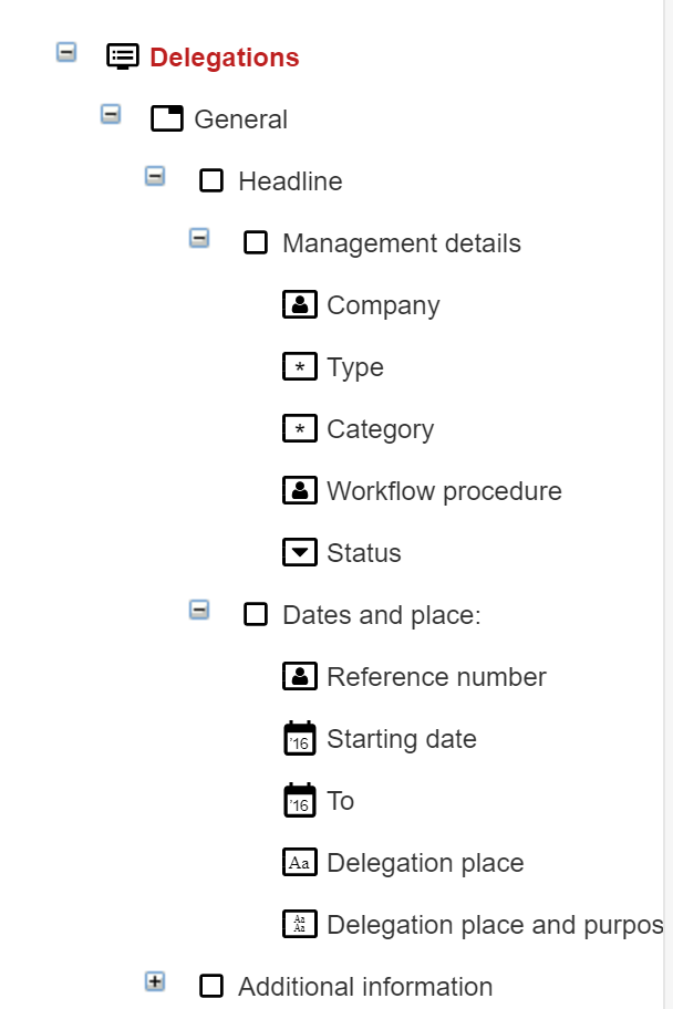
In the above example there is a form (Delegation), then a tab (General), then a container (Headline), two more containers inside the container (Management details, Dates and place), and fields in the containers Management details (Company, Type, etc.), Dates and place (Reference number, Starting date, etc.)
Embedded fields
This article will discuss built-in fields that can be used in various form types. The embedded fields that are dedicated to certain form types were discussed in other articles.
Upload date – a date and time field automatically filled out by the system. This field contains the document creation date in the system. Users can’t edit this field.
Modification date – a date and time field automatically filled out by the system. The field contains the date of the last document modification. Users can’t edit this field.
Added by – an automatically filled-in text field that refers to the user who’s added the document to the system.
Modified by – an automatically filled-in text field that refers to the last user that has modified the document. Users can’t edit field.
Name – text type system field Description – a multi-row field that allows adding long text information without formatting documents.
Description – multi-row field that allows adding longer text information without formating of the document.
Status – a system field that contains the document status.
Complex fields
Comments
This widget is used for posting comments to a document. It consists of an HTML editor and mechanisms allowing to quote and respond to other comments. This widget also allows you to refer to a specific employee which makes it possible to transfer information or commands without starting the document workflow. A typical appearance of this widget on a document looks like this:

Workflow procedure
This widget is used for selecting or changing the workflow procedure. Most often, the workflow procedure is selected automatically – according to the configuration in the Document type settings and workflow procedure.
Workflow
This widget shows the currently running document workflow procedure of a specific document. The widget shows steps that are already completed and steps that are pending. An authorized user can add an activity or change the workflow procedure from here.
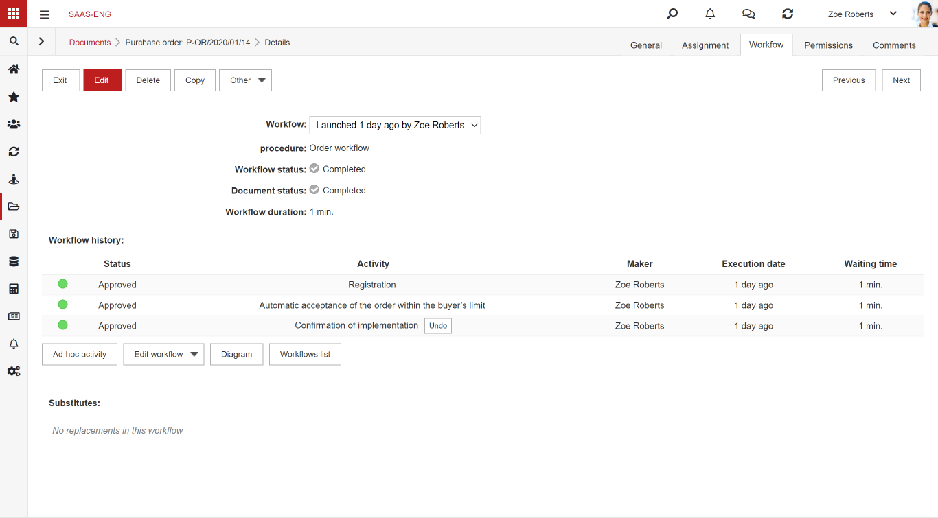
If a document has a defined workflow, then this widget must be present.
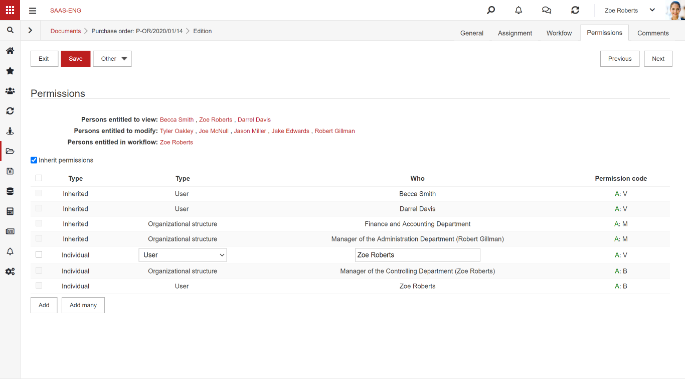
Permissions
This control is used to display permissions for the document. Users with relevant permissions can add new permissions to the document through this widget.
The field must be present on every form to be associated with a document type.
Attributes
Label
The type of field in which you can set e.g. Default value. The value entered in this field acts as a label, therefore it can’t be edited. The field can be used, for example, to display messages.
Textbox
Normal text field to be completed. Used to enter short text information.
Multiline text field (textarea)
Text area with the possibility of setting multiple lines. Used to enter longer text information, e.g. a description field.
Multiline HTML textbox
A field that is an HTML widget – i.e. it provides the ability to insert hyperlinks or tables, bold text, etc.

Integer
Only integers are allowed to be entered in this field.
Floating point number
This field allows entering a numerical value with rounding to 2 decimal places
Date
The field allows you to select a date (without time)
Date and time
The field allows you to select the date and time
Drop-down list (select)
A list that displays data from a given data set. For example, a completed section:

On the document it looks like this:

Autocomplete
A field that uses a dataset. After pressing twice, the system will show available options. Also, as you type, the dataset will be narrowed down to the selected values. As a dataset, I used Dictionary Definitions:

On a document it looks like this:

Autocomplete multiple-choice search
The field works the same way as the autocomplete attribute. However, this control allows multiple selections of the values in the field. Definitions using SQL query:

On the document it looks like this:

Multiple checkbox (checkbox)
This field allows you to select several items from a given data set.
On the document it looks like this:

Single-choice (radio) field
The field allows you to select only one of the items in the data set.

Button
The Button type field enables the execution of a given action. The button can be used, for example, to redirect to a specific URL, create new documents, or perform any action understood as an SQL expression.

Password
This is a special text field that cannot be seen as you type.

Static text
Allows inserting static text, eg. information, to the form
Label
A field type in which we can set ex. Default value. The text, that we can’t edit, will be shown. The field can be conifgurated by using an SQL query in fields: Default value or Field generated automatically. The field may be used for example to show the results of SQl queries.
The difference between a label and static text
In the first time both Label and Static Text attributes are very similar, however the way how they work is different, what makes them suitable for different goals. With Static text attribute we can create an announcement on a form for a user with formatting or a link to a website with full description. Thanks to the easy announcement edition we can prepare good looking form element. But as the name suggest this text is static and can only be viewed as it was created during the system configuration.
Label doesn’t have any appearance configuration. We can only display text. Thanks to the label we can display text calculated dynamically, ex. the number of documents in the system. We can create SQL query no matter how complicated it is and it will still allow us to display information from NAVIGATOR dataset.
File panel
This attribute allows adding attachments (files) to the documents based on this form.
List of attributes
The list allows you to group the fields into one row, with each field treated as a column in the list. To add a list, add an element of the List type and then attach individual columns as sub-elements. Sample list:

View from the document:

Table of attributes
A table in the Navigator system is a set of attributes or built-in fields with a defined number of rows and columns. Columns and rows can be linked together to create the desired structure. Contrary to the list of attributes, there is a rigidly defined number of lines, so the user cannot add or delete lines while working with the document.
To create a table:
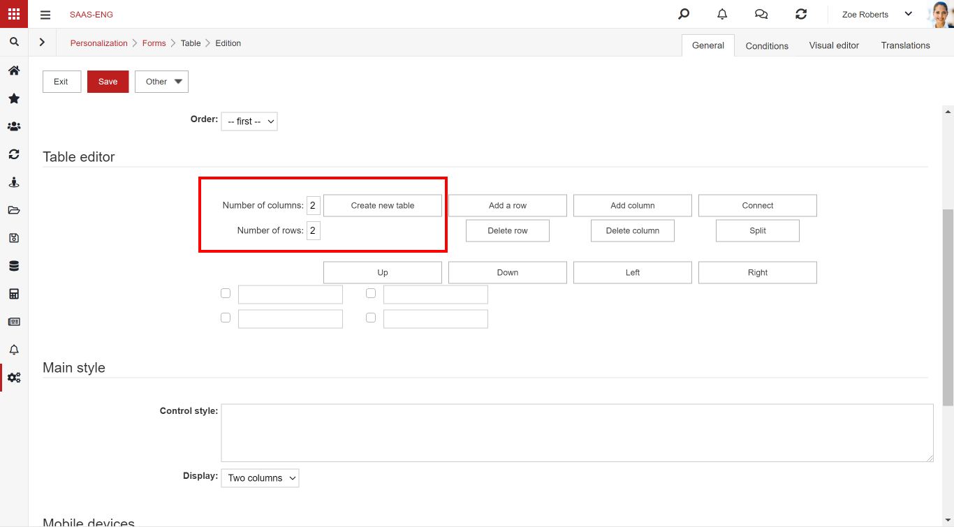
STEP 1: Add table-type elements. After selecting, the Table editor section will be displayed:

STEP 2: Select the number of columns and rows and press Create new table. After generating, fields will appear, which, however, you are not able to complete yet.
STEP 3: Then add the sub-elements to the Table. Sub-elements can be Attributes and Built-in Fields. You add (number of lines) x (number of columns) of such fields. For example, adding a label looks like this:

In this case, 4 fields (2 rows, 2 columns) have been created. You can also add fields directly from the table:
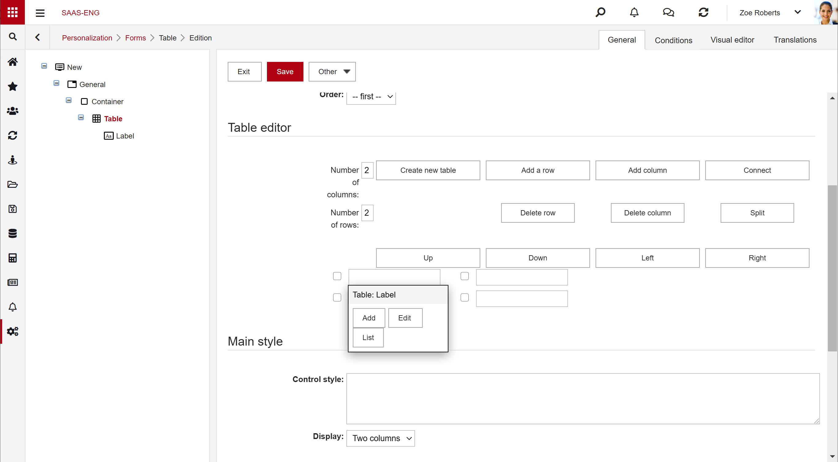
STEP 4: Go back to the table editor and select the items for each field. Below is a more complicated example from the Task form containing planned and actual dates:

View of the configured table on the document:

List
The list allows you to connect and display a specific list previously defined in the system. To do this, add a field of the list type and select a specific list already in the system in the List field

View from the document:

Styles
You can configure styles for form elements (CSS) in the system. The section can be found in the General tab when editing an item. The field uses the CSS language to describe the styles. Each entry should be separated with the separator “;”. Application examples:
- Setting the width of the field/container
- Width: XX %
- Sets the width to XX% of the width of the container in which it is located
- Min-width: XXX px
- Mostly used for containers. It allows you to set the minimum value of the container width (in pixels)
- Overflow:inherit
- Thanks to this setting, the fields in the container (e.g. a set of date fields) smoothly overlap the adjacent containers
- Background-color: #bd1f1f; color: #ffffff
- Background-color is responsible for the background (e.g. of a button)
- Color is responsible for the button text color
- The given values correspond to the colors of the buttons in the Business Navigator system
- Width: XX %